Executive summary
Both prototypes were well-received overall. Where testers got stuck, it was usually about labels, discoverability, and consistency between home and account detail — not the underlying features.
Reading both groups side-by-side, Version 2 wins on more individual components (cleaner hero, discoverable customize, visible account-detail actions), but neither prototype is "done." The recommendation is to merge the best parts of both, summarized below and backed by transcript quotes in the next section.
Caveat: Version 1's sample skewed older and more male (6 of 7 male, 4 of 7 age 60+). For a final preference claim, run a within-subject test with balanced cohorts.
Prototype visuals
These are the screens participants saw in the UserTesting study. Each participant saw only one version. Scroll inside each phone to see the full screen, or click it to open the image full size.
Home screen

Quick actions sit below the chart and include Update Email; filter-style customize icon in the top right.

Only Deposit Check · Transfer Money, placed in the header; financial planning is expanded and sits above the chart.
Brokerage account details
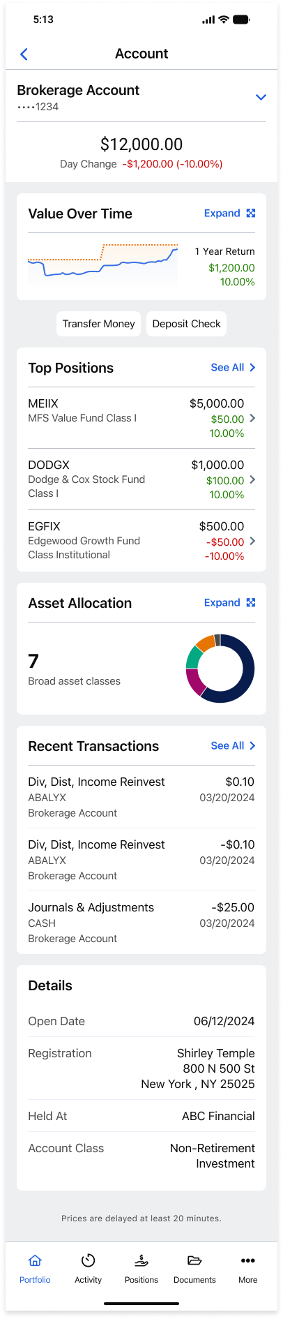
"Account" title with an account-switcher dropdown; Transfer Money and Deposit Check buttons under the chart.
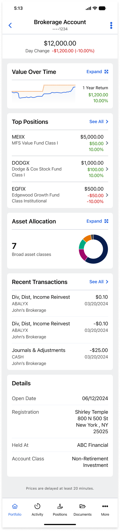
Account name as the title; no visible money buttons, with a three-dot menu in the top right.
Component-by-component verdict
Each row is the working recommendation. Evidence and quotes are in the next section.
| Component | Pick | What to ship |
|---|---|---|
| Home header / hero balance | Version 2 | Use V2 wording ("Current value … as of [date]"). Add an "What's included?" info-tip and label chart axes. |
| Home quick actions | Version 2 | Keep the V2 row (Transfer + Deposit). Drop "Update email." Let users add 1–2 more via the customize sheet. |
| Customize home affordance | Version 2 + rename | Use V2's top-right settings-style entry + the drag/toggle sheet. Rename label to "Customize home" (icon + visible text). |
| Financial planning on home | Same on both — clarify | Keep content. Add info-tips for "Probability of success," use named goals, show methodology inline (avoid the off-app MoneyGuide link). |
| Account-detail title | Either works | Standardize to [Account name] with day change beneath. Not a major complaint zone. |
| Account-detail quick actions | V2 placement + V1-home styling | Use V2's visible buttons (never V1's three-dot overflow) and style them like the home cards. Move them above "Value over time" for parity with home. |
| Advisor module | Keep placement, rewrite copy | Bottom placement is fine for most. Rewrite the card with advisor name, role, last contact, direct Message/Call/Schedule actions. |
| Bottom nav | Fix in both | Make the selected tab reflect drill-in state (Portfolio when inside an account). Strengthen the selected-state visual. |
Why we picked what we picked
1. Home header / hero — use Version 2's wording
V1 testers were unsure what the headline meant; V2 testers read it immediately because the date and breakdown reconcile.
"It just needs a little bit more clarity on which accounts are being used to create that amount." V1 boogie12
"If so, it should say net worth." V1 cardboardfort
"$25,000 as of February 2nd … it is self-explanatory." V2 cocoaismydog
"The 25,000 looks like the aggregate of the brokerage, Roth IRA and cash. And that's confirmed also at the bottom." V2 Fjord33221
Label the chart's Y-axis and add a green/red legend; this fixes the V1 chart confusion that affected multiple testers.
2. Home quick actions — use V2's cleaner row, drop "Update email"
The V1 hero included an "Update email" action that multiple testers flagged as out of place. V2 has no equivalent complaint.
"I think it's a little strange that update email would be here." V1 boogie12
"Update my email. I don't know about updating my email from this spot, but kind of a strange place to put it." V1 Mrjaywalker
"Why is that here? As opposed to being in a tools section." V1 50+ ContentGuru
Use the customize sheet to let users add up to two more (Statements, Recent transactions, or trading actions for power users).
3. Customize home — V2's entry point and sheet, but rename the label
V1's "filter icon → Portfolio screen layout" was the single biggest discoverability failure in the study.
"I'm assuming the filter button is what I needed, but that really wasn't what I expected 'cause it didn't say customize home screen." V1 NiceGerbil5169
"I don't see a customized home screen icon … I would think it would be up there on that menu." V1 Mrjaywalker
"I was looking for a button that would say custom home screen, not an icon … once I found it, this is what I would expect." V1 50+ Wrigs05
V2 testers found it faster because the icon read as "Settings," and the sheet itself was richer (drag to reorder, configurable quick actions, account toggles).
"I'd probably go to the top right where it says settings … so it is, the information shows expectedly." V2 cocoaismydog
"That looks like that's the customized home screen … I can drag these up or down … I can have those quick actions right there in the top, um, blue area." V2 50+ Sunshine2242
But V2 wasn't perfect — three V2 testers also couldn't find it without prompting, so the rename matters either way.
"I don't see any customized home screen option … your version of a customized home screen is the filter button." V2 50+ vp9592
"I don't see that verbiage anywhere. I just guessed." V2 50+ KBB
Add a one-time first-run tip pointing to the affordance to close the remaining discoverability gap.
4. Financial planning — same content on both; clarity is the lever
Both versions show net worth, probability of success, goals, and a MoneyGuide tag. Complaints were about transparency, not version.
"Some of the categories or metrics listed are a little vague, like probability of success." V1 boogie12
"Without having goal names, I really don't know what the values are." V1 50+ Wrigs05
"Maybe there's a little eye next to like this … the information icon … to show me what the probability of success is." V2 50+ KodaBear
"Why do I have to go to another website to track my goals? I have registered here." V2 50+ TreborZ
Avoid sending users to a separate MoneyGuide site mid-flow.
5. Account-detail quick actions — V2 placement, V1-home styling
This is the cleanest "best of both" call in the study.
V1's three-dot overflow was the worst-rated detail in the entire study.
"I don't really like the three dots. I really wanna see the options I have so I can easily use them as fast, especially on the phone." V1 boogie12
"I would look for 'em in recent transactions … if that's the case, then it doesn't match my expectation." V1 NiceGerbil5169
"I would expect the buttons to be up here somewhere." V1 cardboardfort
"So many designers love these three dots … just put buttons, don't hide stuff." V1 50+ ContentGuru
V2 surfaces the buttons explicitly, but its styling is plainer than V2's own home version — and testers noticed.
"On the homepage it actually looked better. On this it's just like a button that just sets a text compared to like the first page … it does not meet my expectations." V2 cocoaismydog
"Don't use different iconography or ways of presenting the quick actions in different places. Consistency of presentation is key for me." V2 50+ TreborZ
"Transferring money or deposit checks should be above … congruent with … right there under the account value." V2 50+ LunaMar
Add a small "Move money" section header so the scan path is obvious.
6. Advisor module — keep bottom placement, rewrite the copy
Most testers said bottom is the right place, but the marketing tone and lack of contact info hurt the experience.
"By the time I hit my financial professional, I have some context." V1 NiceGerbil5169
"Kind of seems like an ad honestly … our team of dedicated professionals … so it's not particularly Joanne." V2 cocoaismydog
"I would expect this paragraph to be something about her bio, her experience, her specialties." V2 50+ TreborZ
"There's no contact information from here. Like, why don't you have that?" V1 50+ ContentGuru
Optional secondary "Contact advisor" shortcut configurable via the customize sheet for users like boogie12 who want it higher.
Method & participants
Instrument: UserTesting-style unmoderated tasks; prototype in a desktop browser simulating mobile.
Demographics (full sample): Female 7 (41.2%), Male 10 (58.8%).
Version 1 (n=7)
Version 2 (n=10)
The V1 cohort skews older and more male. Comparisons between versions are directional; the loudest V1 complaints (three-dot overflow, "Update email" placement, filter icon for customize) are tied to the prototype itself rather than the sample.
Cross-cutting fixes (apply to whichever merged version we ship)
- Color legend everywhere. Both versions left "what does green/red mean?" implicit (Wrigs05, TreborZ, Weefops305).
- Asset allocation donut needs a legend. TreborZ counted donut segments and they did not match the "7 broad asset classes" label.
- Bottom-nav selected state. Use a stronger highlight; reflect the user's actual context (e.g., Portfolio when drilled into an account, per KBB).
- Plain-English labels everywhere. "Portfolio screen layout" → "Customize home," "Goal 1 / Goal 2" → named goals, info-tip on "Probability of success."
- Moderator script + UI copy QA. KBB, LunaMar, and Eddyekamma all flagged confusing wording or typos.
- Prototype stability. Watch Figma performance; ContentGuru's full V1 session was largely tooling complaints.
What to do next
- Build the merged V1 + V2 prototype per the verdict table above.
- Run a within-subject preference test (each user sees both old and new) with balanced age/sex cohorts. This is the only way to make a definitive "we picked the right one" claim.
- Click test the new customize affordance with the renamed label to confirm we closed the discoverability gap.
- 5-second test of the hero metric copy and color legend.
- Proofread the moderator script and all UI strings before the next round of recordings.
Full narrative and additional quotes: research/UX-ANALYSIS.md · AI handoff notes: research/CONTEXT-NOTES.md